The Takis Experience
Brand Identity/ Typography/ apparel design/ poster design/ print
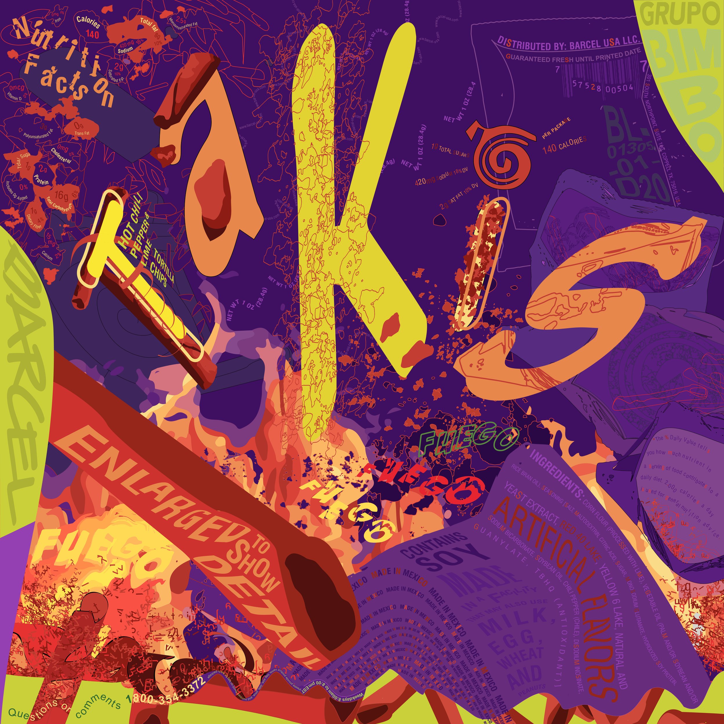
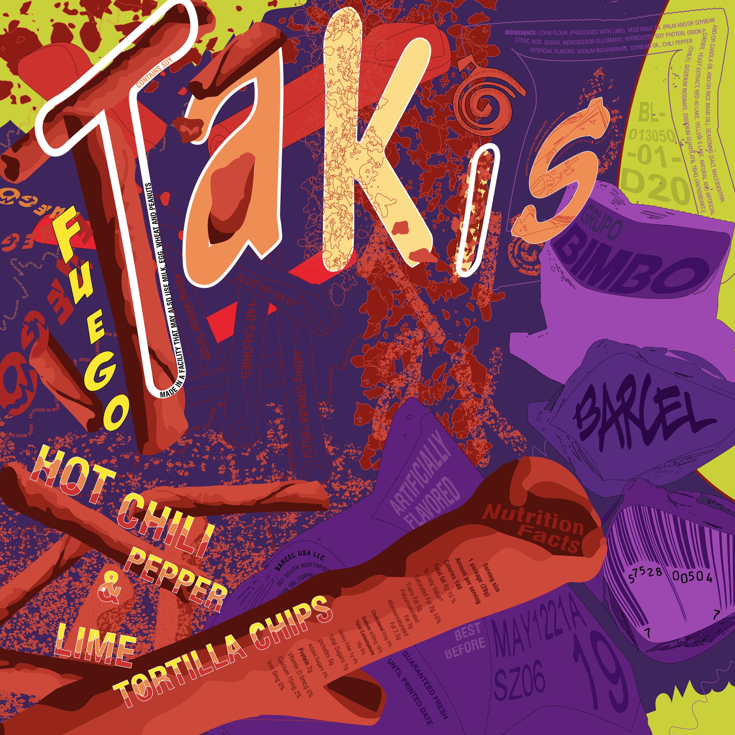
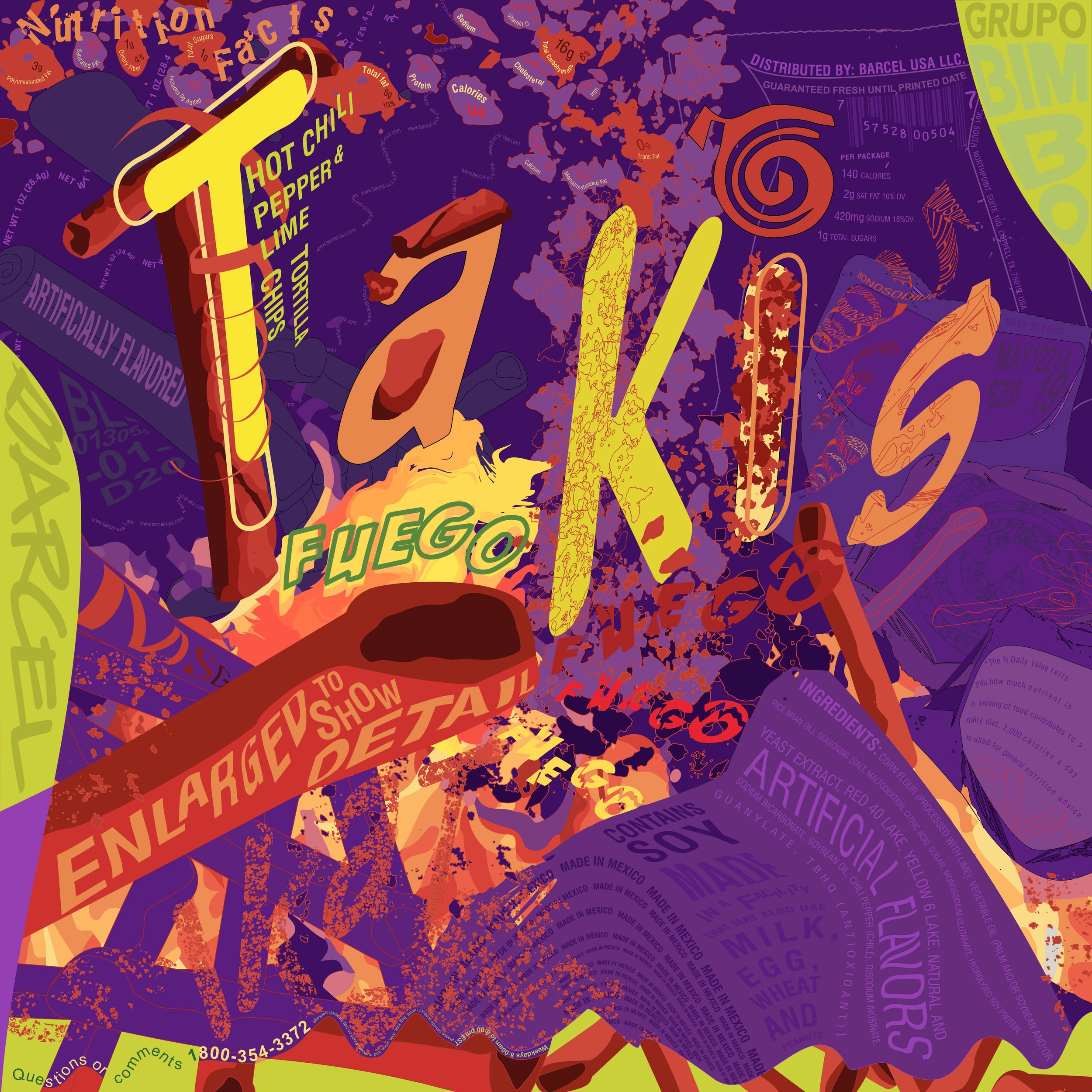
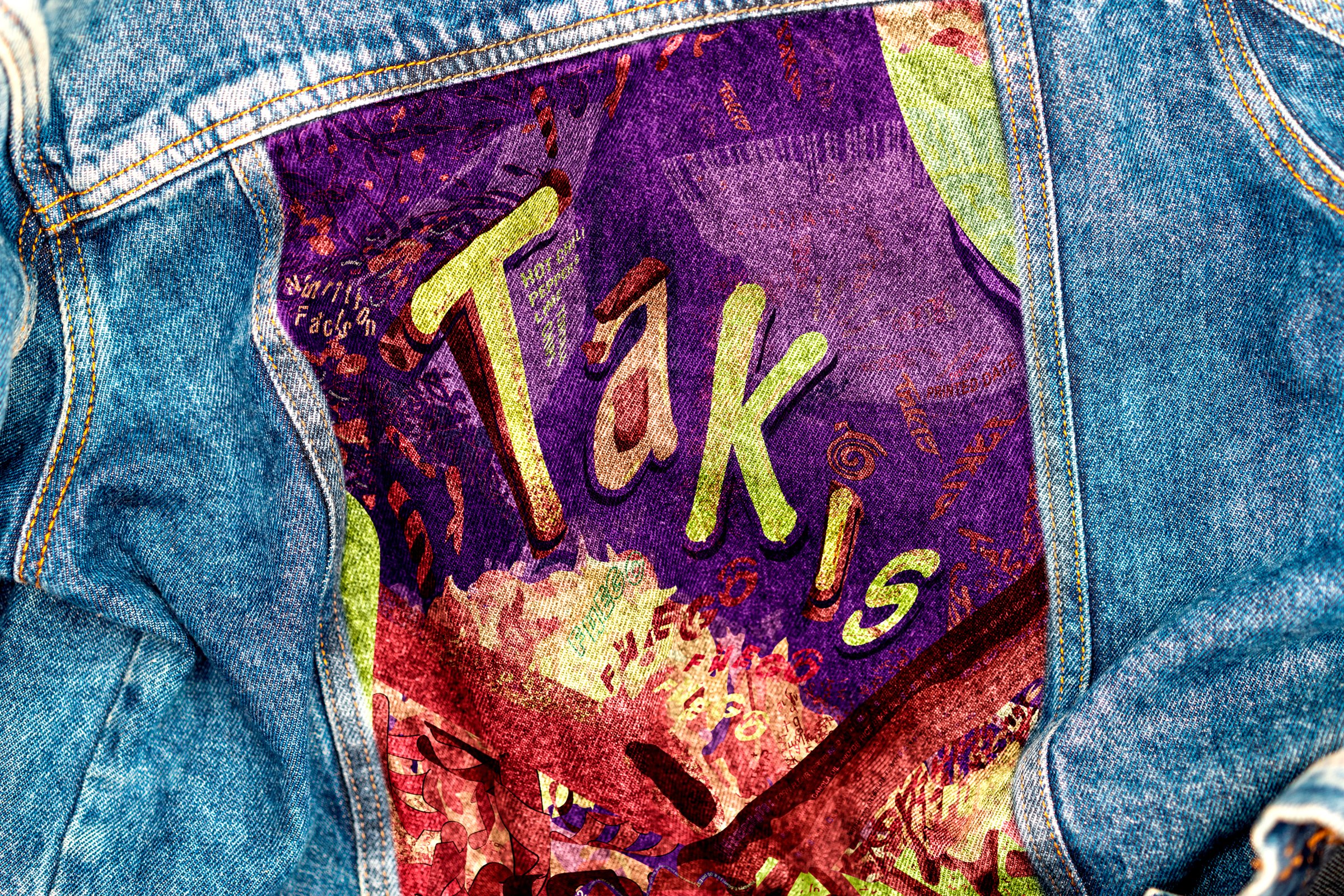
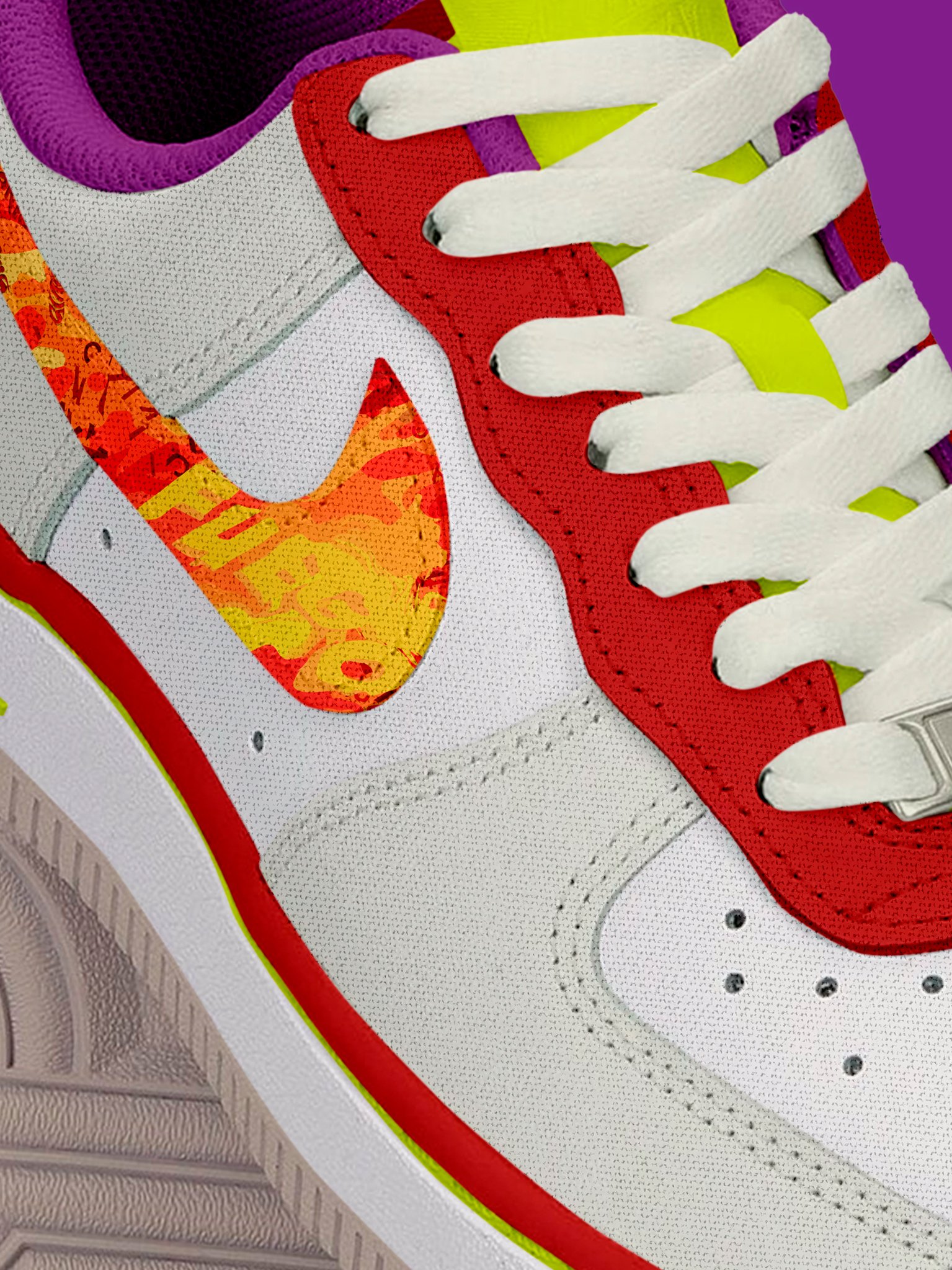
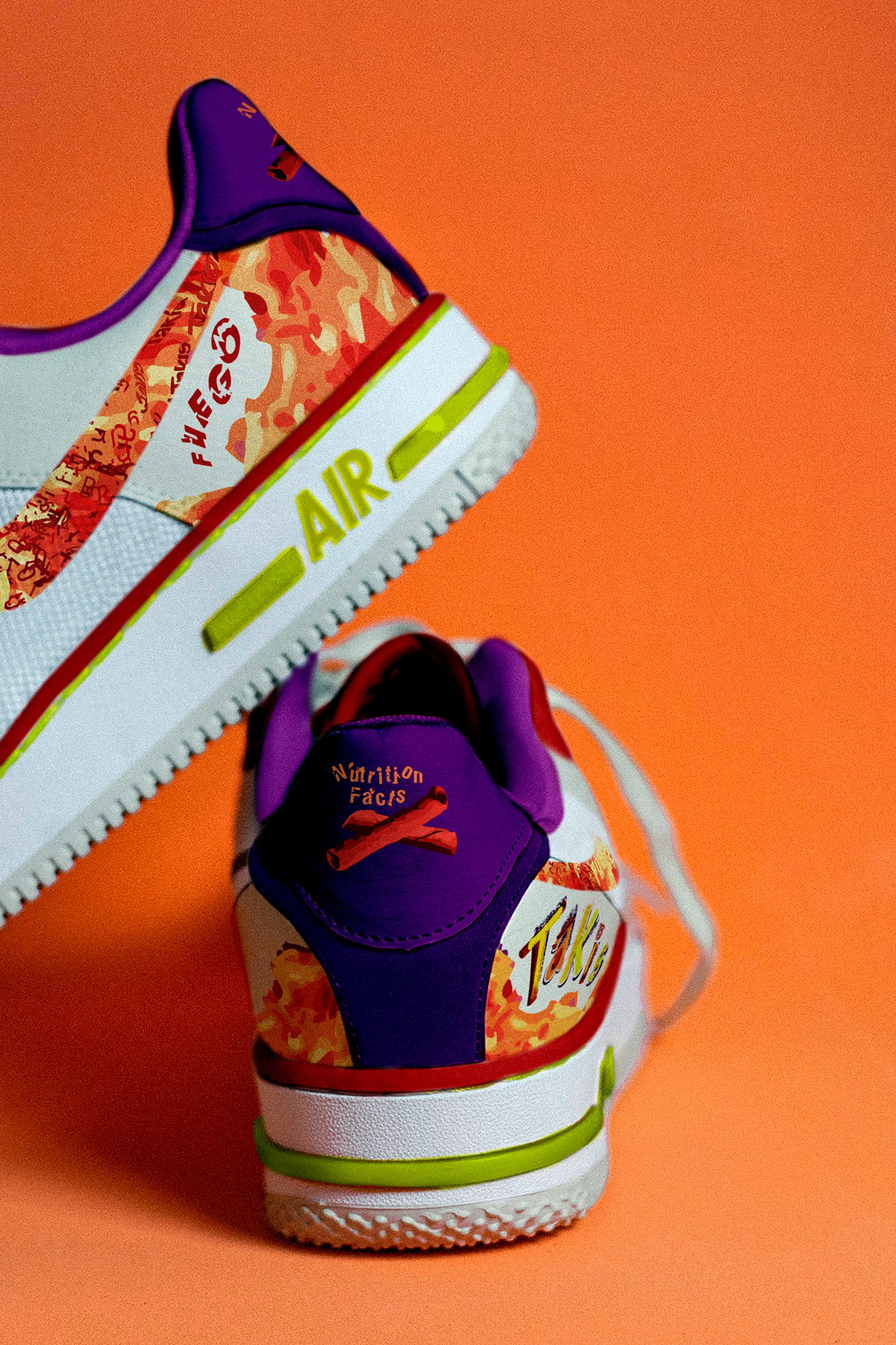
ABOUTThis project is a typographic tribute to the sensory overload of eating Takis—a spicy tortilla chip known for its audacious flavor and over-the-top branding. Using only type pulled directly from a mini snack bag—including the logo, nutritional facts, and ingredient list—I created an intricate poster and mock collateral that celebrate the brand’s maximalist personality in a way that feels both chaotic and cohesive.
Bold and dramatic, the final design channels the same punch Takis delivers with each bite—loud, high-intensity, and unapologetically extra. From typography to composition, every element was designed to feel brand-appropriate yet elevated, honoring the snack’s cult status with a twist of creative wit.
Supervising ProfessorSohee Kwon
Year of Completion2021


THE SPARKTakis aren’t subtle—and that’s what makes them iconic. When I first tasted them, I couldn’t understand the hype. But over time, I became fascinated by the sheer audacity of their flavor and aesthetic. Salt, acid, spice, MSG, and that intense neon red—they’re practically performance art in snack form.
This project is my love letter to that boldness. I wanted to celebrate the contrast between how Takis are perceived—loud, brash, indulgent—and how design can embrace those traits without losing intentionality or polish.
PROCESSI meticulously deconstructed every piece of type from a Takis snack pack—logo, barcode, ingredients, even the small print—and used it to build a rich, detailed typographic system. Craggy shapes and chaotic type arrangements mirror the physical experience of tearing into a bag, while small speckled letterforms evoke the finger-staining aftermath of every handful.
In the poster, I subtly highlight every “M,” “S,” and “G” as a playful nod to the snack’s infamous flavor enhancer, embedding meaning into the chaos. The overall composition balances maximalism with structure, using typography to visually simulate the flavor explosion that defines Takis. From packaging mockups to apparel concepts, every piece leans into the drama—because Takis wouldn’t have it any other way.

