The Mulan Story
Typography/ Brand Identity/ Photography/ Chinese-English
ABOUTYoung Ones TDC 2023- Lettering
This project is the typographic voice and visual narrative for Mulan Hua, the legendary Chinese female warrior. By researching Mulan’s history, I explored type forms through the lenses of her legacy in both China and in America.
AwardsSupervising ProfessorSohee Kwon
Year of Completion2022
THE SPARKAs an Asian-American raised on Disney cartoons, for the longest time, my awareness for my Chinese heritage began and ended at Disney’s Mulan. Disney’s Mulan—beautiful, fearless, and loyal—gave me reason for once to be proud of my roots.
Fast forward to now, after taking numerous advanced Chinese language classes, advancing to Classical Chinese language, and being a professional Chinese Classical dancer for over a decade, I took it as a personal goal to be an ambassador for my culture. As much as I loved Disney’s Mulan, I wanted to bring something a bit deeper to her identity through this project.
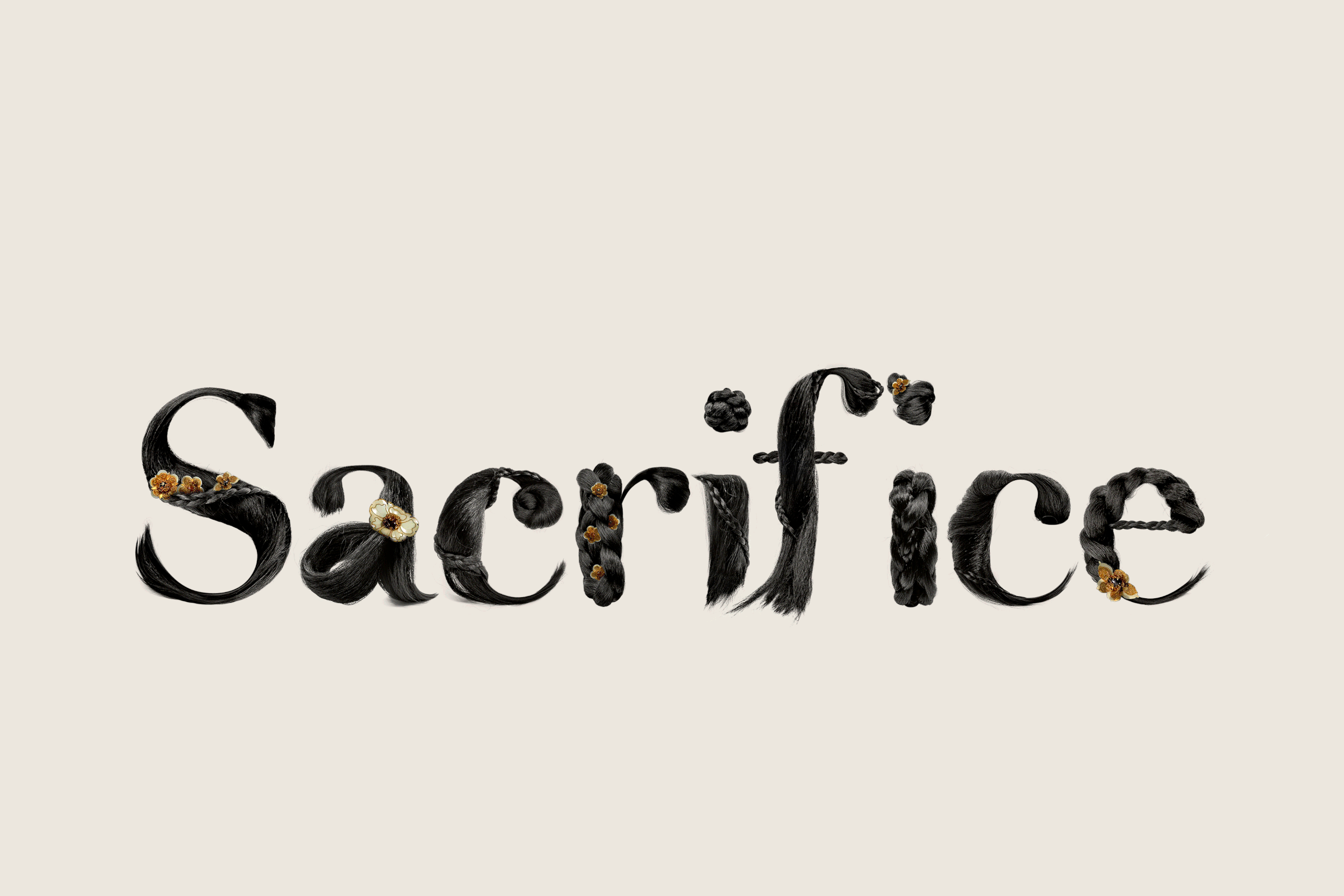
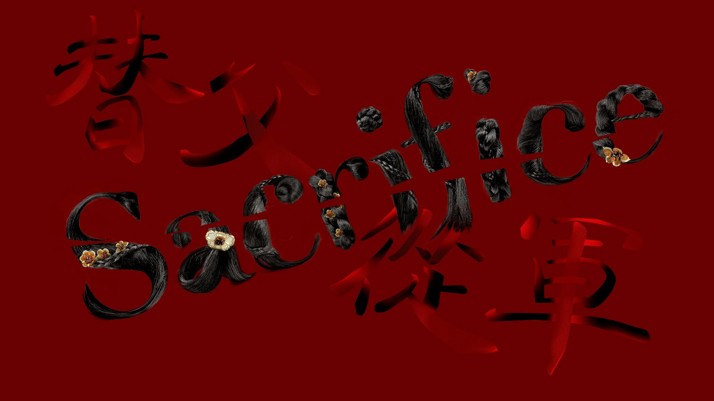
1/ Sacrifice
This typographic piece draws from one of the most iconic moments in Disney’s Mulan—the scene where she cuts her hair before joining the army. While researching, I learned that the historical Mulan likely came from a wealthy, protected background, where beauty and refinement were integral to her life. In ancient China, young maidens often showcased their long, lustrous black hair in intricate, elegant styles. I meticulously sculpted each letter from these historically inspired hairstyles—every curve and lock rendered with care—only to slice them cleanly in half. This sharp cut becomes a visual metaphor for the sacrifice Mulan made: severing not only her hair, but also the comfort, identity, and privilege it symbolized.
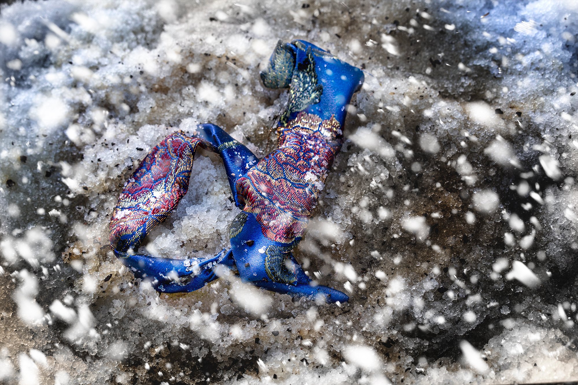
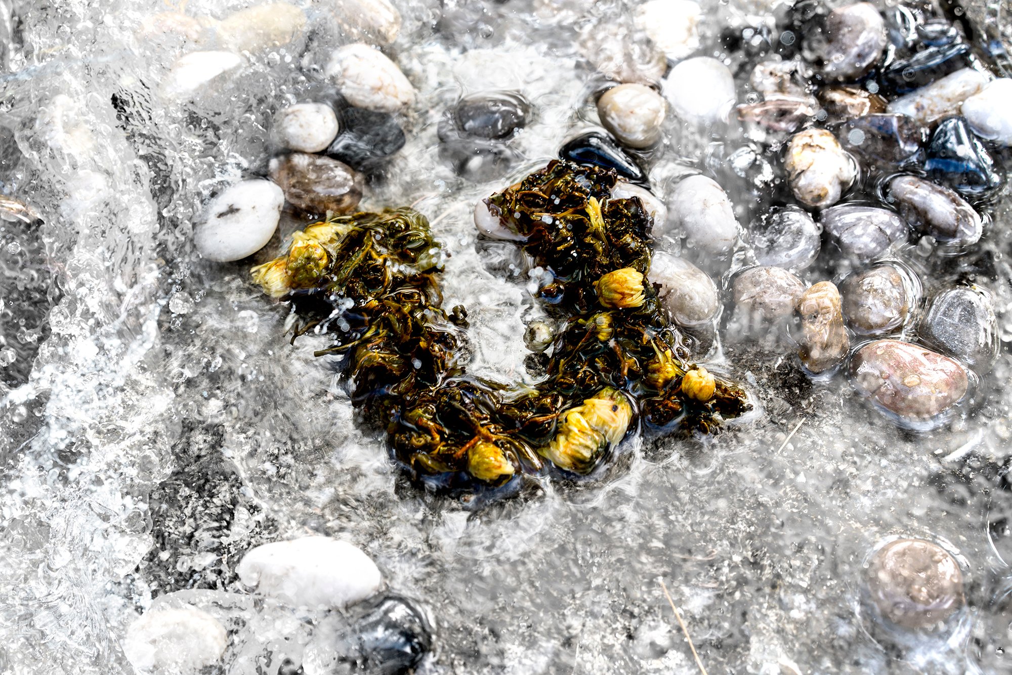
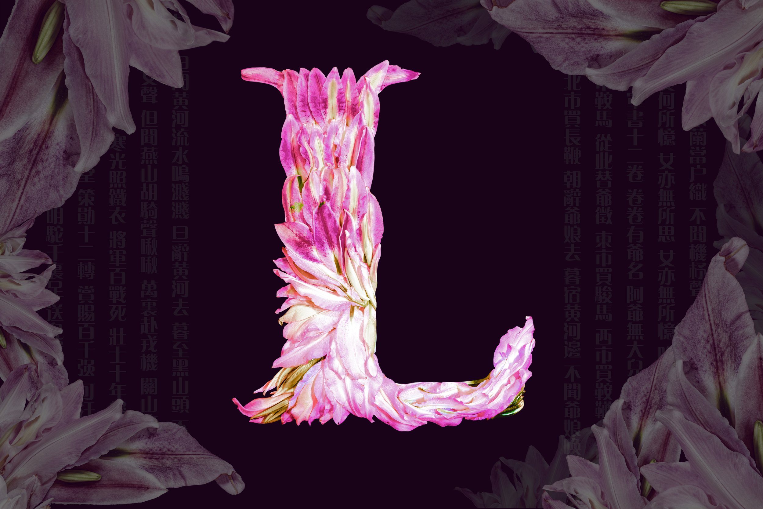
2/ Demure
“Quiet and demure…” recites Mulan as she struggles to memorize some of the many social expectations before meeting the matchmaker. Who would imagine that instead, this ‘demure’ maiden goes on to fight in the army for twelve years! This piece juxtaposes the societal and gender norms of her time period by using different materials to reflect her long arduous journey and experience in military.
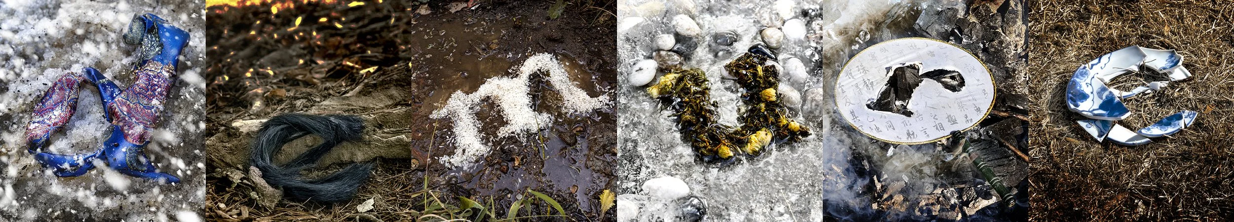
Silk Brocade/ Snowy Mountains

Hair/ Burning Battleground

Rice/ Muddy Trail
Tea Leaves/ River
Round Fan/ Smokey Ruins

Broken Porcelain/ Dry Grasslands
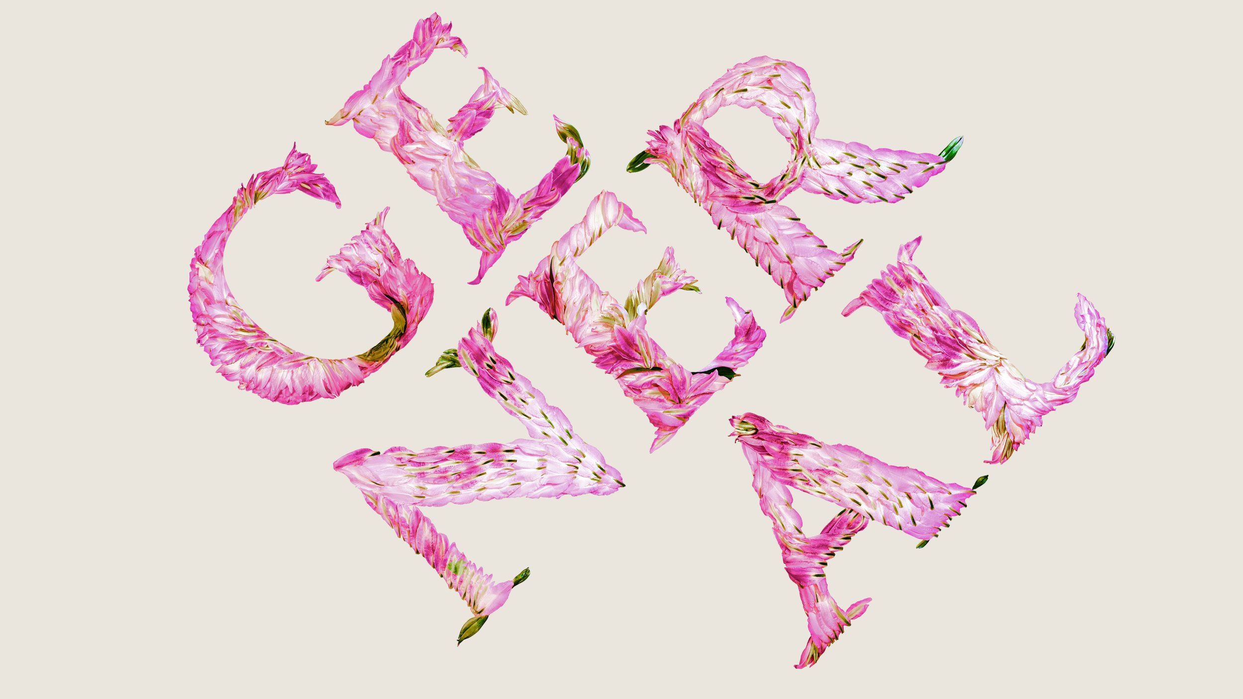
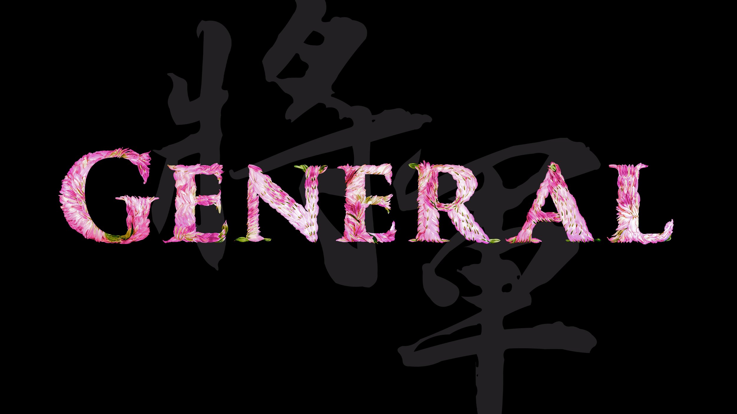
3/ The Flower General
In Chinese, Mulan’s name means ‘magnolia,’ which pairs suitably with her last name, which means ‘flower.’ This type is inspired by how Mulan was referred to by her fellow soldiers as ‘General Hua’ while she was in the army, which translates to ‘General Flower.’ Each letter is carefully crafted from numerous real lily-magnolia flowers.

4/ Under the Armor
One scene never forgotten in any Mulan adaptation is the inevitable bath scene. The direction of this composition draws upon how Mulan used armor to disguise the fact that she is a woman, and only when removing the armor can she relax in total privacy. The type in this piece is inspired by deeply empathizing about how I imagined Mulan would only be able to wash herself under a shield of darkness, hence the scene portrays a night scene, and the letterforms MAN fray and relax in the privacy and secrecy of the waters.


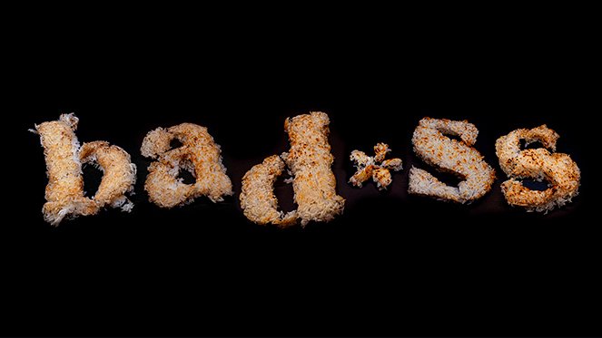
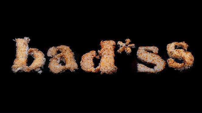
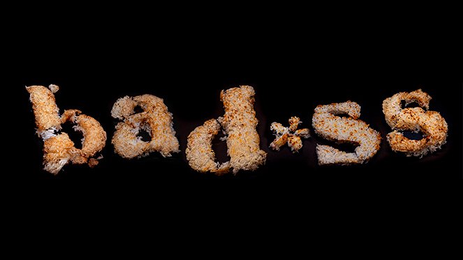
5/ The Most Bad*ss Disney Princess
“A single grain of rice can tip the scale. One man may be the difference between victory and defeat.” Mulan, a seemingly ordinary young lady, was exactly the grain of rice China needed. For this piece, each letterform was meticulously created using scorched rice, symbolizing how one can rise above and beyond the expectations of any humble and unexceptional roots. I decided to censor the word, because despite ‘badass’ being quite likely the best English phrase describing Mulan, ultimately, she is still a childhood hero, her story inspiring children around the world for generations.


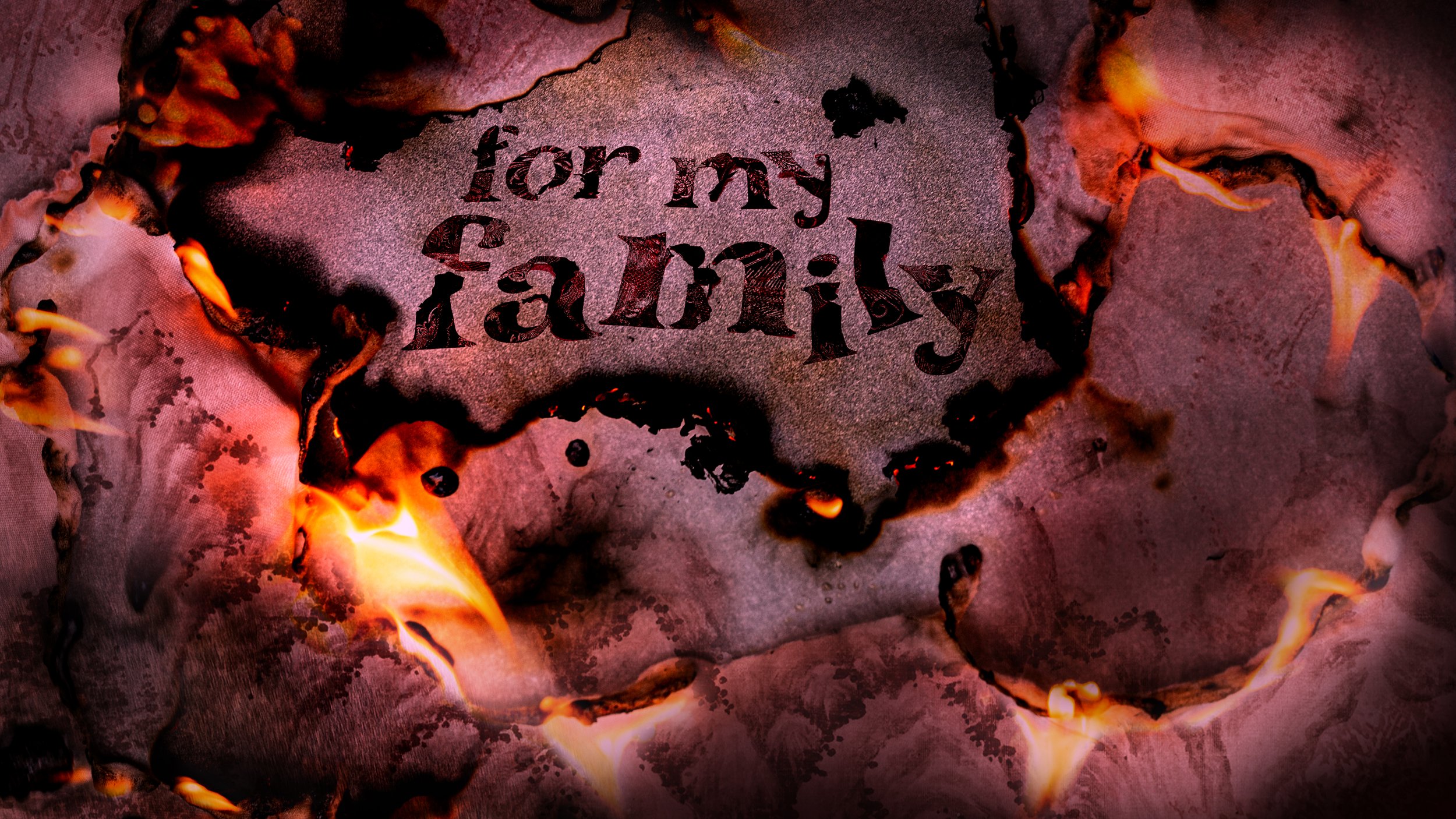
6/ For My Family
Though Mulan’s story has evolved through the hundreds of years since its first mention, the core of her tale has never changed—her love for her family. Each letterform uses traditional silk brocade patterns, which burned and ruined, symbolize the extraordinary sacrifice, selflessness, and courage behind this young lady.